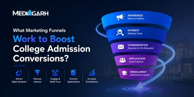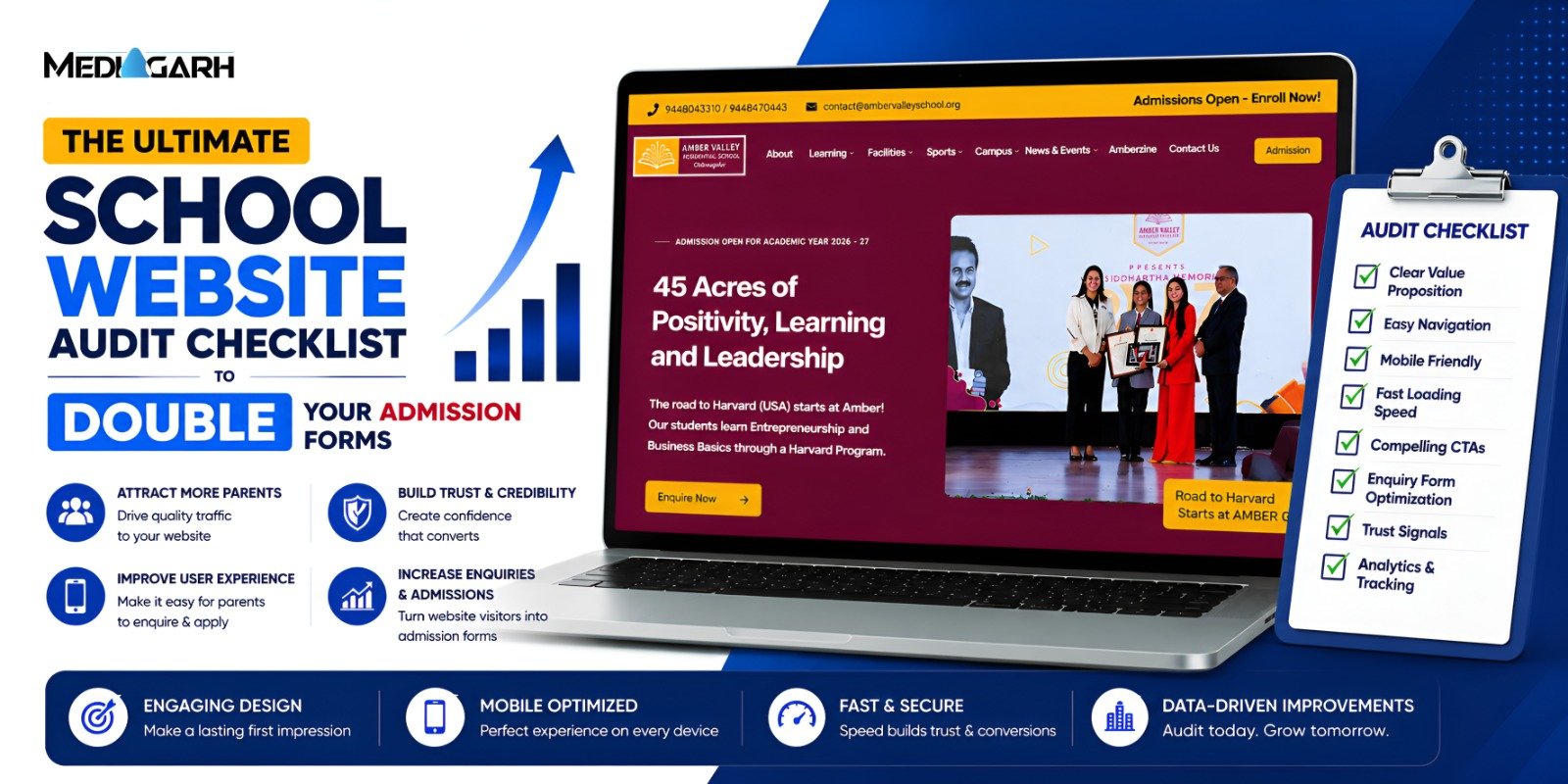
Most schools and colleges think that generating leads is only possible with paid marketing. But what they don’t realize is that they are clearly losing numerous organic admission enquiries that may come directly through their institute’s websites. All because of simple (mostly rookie) mistakes that they make on their websites. The important part is that most schools and colleges spend a considerable sum on making their websites visually appealing.
Website enquiries won’t just flow through after you’ve created a beautiful website. Usability is a rarely prioritized factor. This is why user experience (UX) and user interface (UI) are highly demanded fields today. The truth is that in the presence of structural mistakes, even the metric of high website traffic won’t increase school admissions. In this blog, we list down some of the most common mistakes that quietly reduce enquiry numbers—and how schools and colleges can fix them.
- Treating the Website Like a Digital Brochure
In today’s time, most websites are highly dynamic pages that have consistent visuals. However, what schools and colleges are still doing is that they host long texts about the institution’s history, philosophy, and leadership, and some institute images here & there. A parent or student is genuinely unconcerned about how the school or college was established or about their team. They need information about the curriculum, admission process, facilities, and more. Basically, websites are structured more like brochures instead of being clear admission pathways.
What works better: Treat your website like a journey for the visitor and ensure simple and accessible admission-related information.
- Lack of Clear Call-to-Action (CTA)
When visitors are on your website, you can’t expect them to act on their own. Your website completely controls their behaviour. CTA is among the most important education marketing strategies. It means when users have completed reading about your school, they want you to tell them about how to proceed. Either the enquiry form is difficult to find, or there are just too many options that make it confusing for the visitor.
What works better: Guide users towards a clear CTA that makes the next step pretty obvious. Add:
- “Request Admission Details”
- “Book a Campus Visit”
- “Speak to an Admission Counselor”
- Sending Paid Ad Traffic to the Homepage
This mistake can also be considered among the most common paid marketing mistakes schools and colleges make. Many institutes direct their paid campaign viewers to the homepage instead of a dedicated landing page. The simple reason this is not feasible is because of the distractive nature of the home page, and visitors might bounce off.
What works better: Keep your homepage and landing pages separate. Landing pages highlight key benefits, provide concise information, and include a simple enquiry form.
- Slow Website Loading Speed
Website loading speed is another simple fix you can execute that exponentially increases your enquiry numbers. You might lose visitors while your website is loading. Most website visitors you will get are browsing on mobile, where large image files, poor hosting infrastructure, and unoptimized code or plugins might slow down their experience, leading to lost potential enquiries. For example, websites made for higher education marketing are largely developed as platforms only accessible on desktops.
What works better: Use PageSpeedInsights by Google and ensure a smooth user experience.
- Poor Mobile Experience
This connects to the last mistake we discussed about the page loading speed. Parents and students are mobile-heavy internet users, and over 90% of your visitors will be accessing your website through a mobile device. But most college and school website development stops at optimizing it for desktop. A desktop-optimized website malfunctions and degrades the user experience on mobile devices. It frustrates visitors and reduces enquiry submissions.
What works better: While you can start with a desktop website, you should simultaneously optimize the website for smaller screens and easy navigation.
- Complicated Enquiry Forms
You don’t have to conduct the entire interview on the website only. The enquiry form should stay very crisp and quick to fill (mostly auto-fill). Long enquiry forms seem tiring to visitors and discourage them from engaging in the process. They are looking for quick interactions, not big questionnaires. Big enquiry forms mean you are neglecting other touchpoints in digital marketing for educational institutions.
What works better: Only include ultra-important details in forms, and let counselling do the rest of the job. Ask about (representative fields):
- Parent name
- Contact number
- Child’s grade level
- Lack of Parent-Centric Messaging
The institution talk doesn’t interest your visitors, i.e., parents and students. What most schools and colleges will do is boast about their achievements and talk little about child development, safety, and future opportunities. If your copy doesn’t talk about the student experience, visitors will feel an emotional disconnect.
What works better: Frame communication around the benefits for students and families rather than just institutional credentials.
Final Thoughts
A website plays a very important role in your institute’s admission journey. You can consider a website visit the first intentional step by parents and students for your institution. Making it just visually appealing is not enough. Integrate concepts of clarity, usability, and conversion in your website structure. By addressing these simple mistakes, you can make transformational improvements in admission enquiries. If website development seems complex for you, hire a digital marketing agency for schools and colleges, and they will develop a website that acts like your active partner in the admission process.